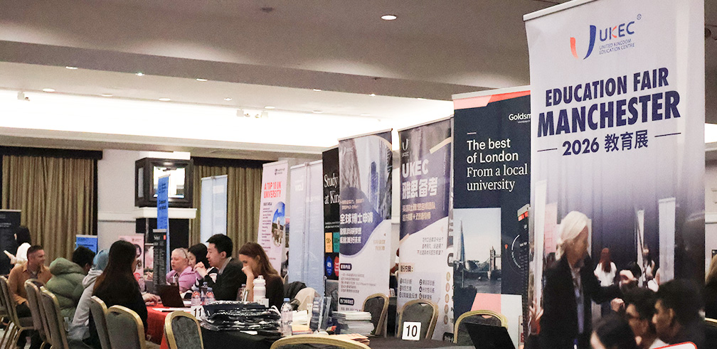
UKEC Education Fair 2026 Manchester
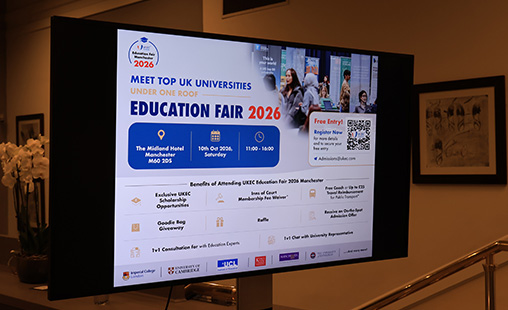
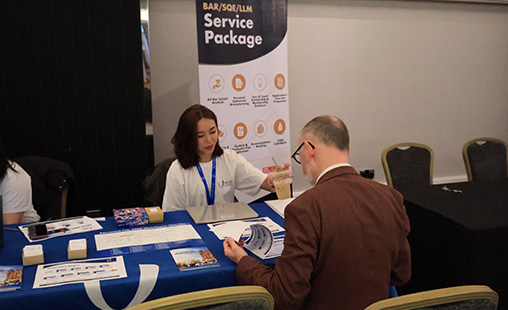
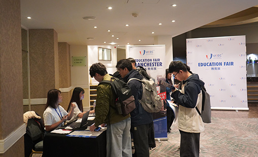
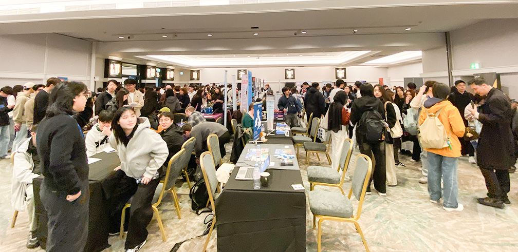
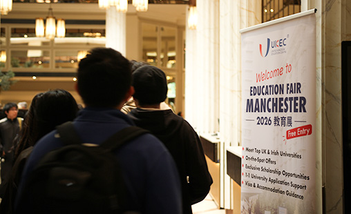
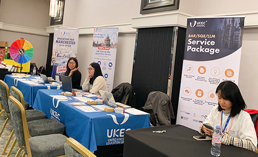
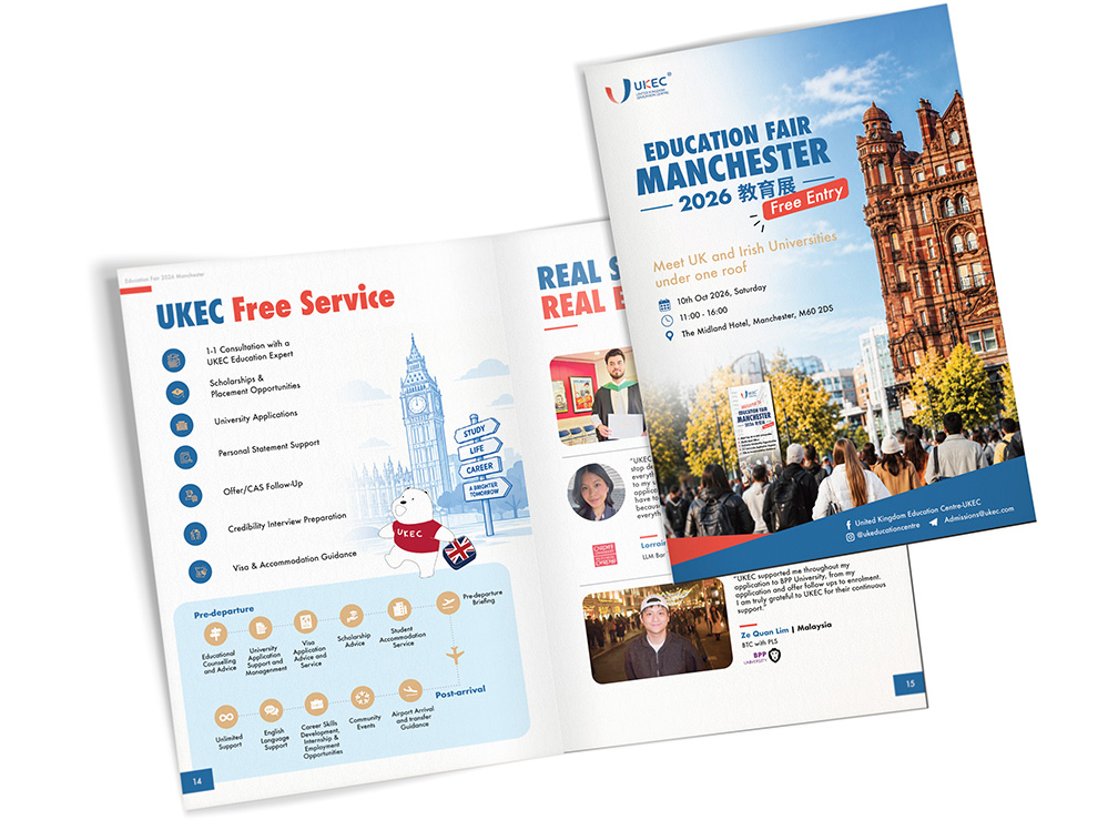
The UKEC Education Fair 2026 Manchester brought together leading universities from across the UK and Ireland, giving prospective students the opportunity to explore their study options, meet university representatives and receive personalised application guidance. As a freelance graphic designer working with UKEC, I developed visual materials to support the event, including a comprehensive 24-page event brochure designed to inform, engage and guide visitors throughout their experience. The project combined event promotion, editorial design and information design, with a focus on creating a consistent visual identity across different types of content.
The Design Challenge
An education fair involves more than bringing universities and students together. Visitors need to navigate a busy venue, identify relevant institutions, understand application opportunities and access practical information quickly.
The challenge was to present a large amount of information in a format that felt welcoming, professional and easy to navigate.
The brochure needed to balance promotional messaging with practical guidance, while maintaining a consistent visual language across university information, step-by-step instructions, student testimonials and local travel content.
Creative Approach
I used a structured editorial approach built around clear typography, consistent spacing, colour-coded elements and accessible visual communication.
UKEC's blue, red and white brand palette formed the foundation of the design, supported by bold headings, illustrated icons and carefully organised content blocks.
Different sections were given their own visual treatments while remaining connected through a consistent layout system. This allowed the brochure to feel varied and engaging without losing clarity or brand recognition.
Editorial Design & Visual Hierarchy
The 24-page brochure brought together a wide range of content, including event highlights, university information, student experiences, local attractions and travel guidance. I focused on creating a clear reading hierarchy, allowing visitors to scan key information quickly while still providing enough detail for those who wanted to explore further.
A combination of editorial grids, photography, illustrations and structured layouts helped establish a consistent rhythm throughout the publication.
Making Complex Information Accessible
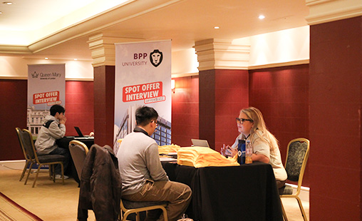
One of the key aspects of the project was transforming detailed event procedures into easy-to-follow visual guides. The Spot Offer section presented the interview and application process as a six-step journey, supported by document checklists and example interview questions.
The Travel Reimbursement section organised the claim process into a numbered sequence, helping visitors understand what to prepare, where to go and how to submit their requests.
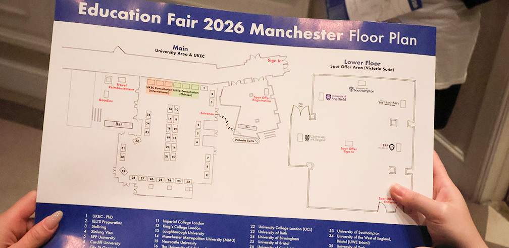
I also incorporated university listings, venue floorplans and a Manchester city guide to help visitors plan their day and navigate the event with confidence. These elements demonstrate how thoughtful information design can make detailed content more approachable and useful.
A Consistent Event Experience
The brochure was designed to function as both an event publication and a practical visitor guide. Beyond promoting participating institutions, it provided useful information for every stage of the visitor experience — from preparing for university conversations to navigating the venue and exploring Manchester.
The visual system supported different content formats while maintaining a coherent look and feel throughout the publication.
Final Outcome
The completed brochure brought together promotional content, editorial storytelling and practical event information in one cohesive design.
The project demonstrates my ability to work with complex content, develop consistent branded layouts and produce detailed, multi-page artwork for a real-world event.
It also reflects my broader approach to design: combining visual creativity with clarity, usability and attention to detail.